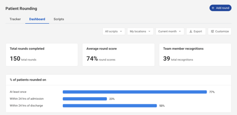
The Patient Rounding Dashboard provides key insights and analytics to help leaders review and take action on rounding data.
Key Benefits
- View patient rounding trends over time.
- Compare rounds documented in Laudio across patient experience domains.
- Customize the dashboard to highlight the most relevant data for leaders.
How to use the Dashboard
- Click Patient Rounding on the left-hand side navigation bar.
- Click Dashboard.
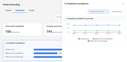
- Within the dashboard, view details on completed rounds, including counts, scores, team member recognitions, patient distribution, and score comparisons across patient experience domains.
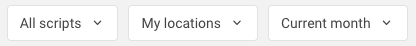
- Use the filters in the top right to tailor your view by form, location, or date range.
- Click into widgets, the spider chart, or the heatmap to explore more detailed insights for specific data points.
- Click Customize in the top right to show or hide elements and personalize your dashboard.
FAQs
Q: Are any of the widgets clickable?
A: Yes. The widgets and data elements are clickable for additional insights.
Q: Can data be exported from the dashboard?
A: Yes. Data can be exported from the upper right corner of the dashboard.
Q: Can the dashboard be customized?
A: Yes. The dashboard can be customized at the individual user level.
Q: How are the scores on the spider chart populated?
A: The scores on the spider chart are based on the point values assigned to each question.
Q: Is there an integration with HCAHPS?
A: We are currently exploring HCAHPS integration with select clients. If you are interested in learning more or participating, please contact Support@Laudio.com or reach out to your health system’s dedicated Laudio Client Engagement representative.
A: We are currently exploring HCAHPS integration with select clients. If you are interested in learning more or participating, please contact Support@Laudio.com or reach out to your health system’s dedicated Laudio Client Engagement representative.
Q: What timeframe does the Compare Metrics table show?
A: The Compare Metrics table reflects the date range selected in the dashboard filters. When the date range is adjusted, the table automatically updates to display data corresponding to the selected timeframe.
Q: How do I add an patient experience category to a question in Patient Rounding so it appears in the spider chart?
A: Form or script owners and collaborators can assign patient experience categories to questions, typically managed by a member of the patient experience team. If updates need to be applied retroactively, please contact Support@Laudio.com or your Client Engagement representative so the Laudio team can assist.
A: Form or script owners and collaborators can assign patient experience categories to questions, typically managed by a member of the patient experience team. If updates need to be applied retroactively, please contact Support@Laudio.com or your Client Engagement representative so the Laudio team can assist.