![Laudio_Wordmark_RGB_Color (1)-3.png]](https://support.laudio.com/hs-fs/hubfs/Laudio_Wordmark_RGB_Color%20(1)-3.png?height=41&name=Laudio_Wordmark_RGB_Color%20(1)-3.png)
The Data Insights tab within each InForm provides leaders with real-time analysis of form questions and responses.
It offers both high-level summaries and detailed drill-down views, enabling leaders to explore individual questions, apply filters, and compare responses across the form. This makes it easier to analyze results and act on the feedback collected.
Key Benefits
- Real-time data with no manual analysis required
- Interactive visuals and graphs with flexible filtering options to highlight the most relevant data
- Heatmaps and trending views to quickly identify areas of celebration and opportunities for improvement
How to Use Data Insights
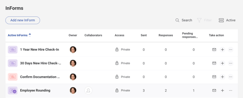
- From the left-hand navigation bar, click InForms.
- On the main InForms page, click the specific form you would like to review.
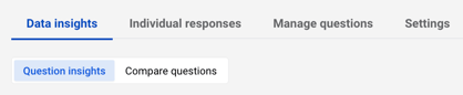
- Within the script, click the Data Insights tab to access insights for each question and compare responses across the form.
- Use the filters in the top right corner to adjust the location and date range based on your needs.

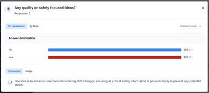
- Use Question Insights to explore detailed data for each question:
- Questions are grouped by question type for easier review
- Each question includes key metrics such as top answer choices, scores, response counts, and comments (when applicable)
- Click into any question to view visualizations and further analyze the data using filters like location and timeframe
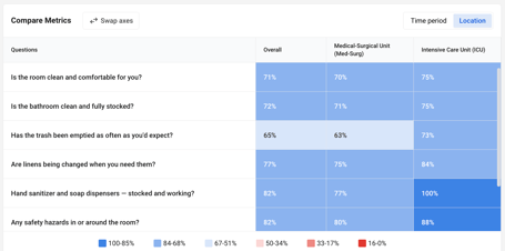
- Use Compare Questions to analyze trends across the form:
- View heatmaps to compare responses by location or timeframe
- Click any heatmap cell to drill into additional graphs and further explore the data with filters
FAQs
Q: Does the data update in real time?
A: Yes, Data Insights reflects real-time data updates.
Q: How can I capture the graphs?
A: You can view graphs directly within Laudio by adjusting the date range filter as needed, or capture them by taking a screenshot on your computer.
Q: What timeframe does the Compare Metrics table show?
A: The Compare Metrics table reflects the date range selected in the dashboard filters. When the date range is adjusted, the table automatically updates to display data corresponding to the selected timeframe.
A: The Compare Metrics table reflects the date range selected in the dashboard filters. When the date range is adjusted, the table automatically updates to display data corresponding to the selected timeframe.
Q: What does the “pill” represent on the Data Insights tab?
A: The pill icon, under the average score column, represents a trend indicator based on the selected time period. It dynamically compares performance in the current period to the previous period, using the timeframe defined in the dashboard filters.
A: The pill icon, under the average score column, represents a trend indicator based on the selected time period. It dynamically compares performance in the current period to the previous period, using the timeframe defined in the dashboard filters.